
Designing Beyond Default Settings
When many developers first learn Power BI, they focus heavily on writing complex DAX queries, importing clean datasets, and building relationships. But when they present their dashboards to executives, they are met with blank stares or confusion.
Why? Because a dashboard's UI/UX determines its adoption. If your report looks like a random cluster of multi-colored charts, enterprise users will struggle to extract insights.
To build reports that drive action, you must apply user-oriented design principles. Here are the 5 best practices to transform your Power BI dashboards from standard technical grids into premium enterprise reports.
1. Respect the Z-Pattern Layout
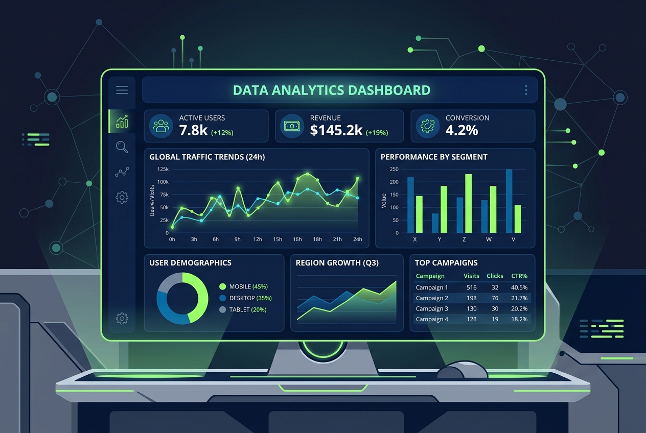
Human beings read web pages and dashboards in a Z-pattern (from top-left to top-right, down, and then bottom-left to bottom-right). You should place your visual elements along this logical scanning pathway:
- Top-Left (High Value): Corporate logo, page title, and key high-level filters (slicers).
- Top-Row (KPI Cards): Your most critical metrics (e.g., Total Revenue, Active Customers, Conversion Rate). These should be simple numbers without complex visual noise.
- Middle Section (Core Trends): High-level trends over time (e.g., Line charts showing monthly growth or comparisons).
- Bottom Section (Granular Details): Detailed tabular records, matrix grids, or secondary breakdowns.
2. Eliminate Cognitive Load (Keep It Simple)
The most common mistake is cramming too many visuals onto a single canvas. This causes "dashboard fatigue."
- Rule of 6: Try to limit a single dashboard page to a maximum of 5 to 6 visual elements (excluding KPI cards and slicers). If you need more charts, split them across multiple dedicated tabs (e.g., an "Overview" tab, a "Detailed Sales" tab, and a "Customer Demographics" tab).
- Avoid Pie Charts with >3 Slices: Pie and donut charts are difficult for the human eye to compare quickly. Instead, use a horizontal bar chart sorted from highest to lowest. It makes comparisons instant and leaves room for clear category labels.
3. Leverage Color Hierarchy Strategicially
By default, Power BI assigns random colors to different segments in a chart. For an enterprise-grade report, you must control your palette:
- Define a Dominant Color: Choose one primary color (usually matching the client's corporate brand) for 80% of your charts.
- Use Accent Colors sparingly: Use a distinct accent color (like a vibrant cyan or orange) only to highlight key insights, such as target thresholds, anomalies, or selected items.
- Apply Semantic Colors properly: Only use red, yellow, and green to indicate status (Bad, Warning, Good). Using red simply because it matches a segment label will confuse readers into thinking that segment represents a failure.
4. Build Centralized Slicers
Instead of scattering dropdown filters randomly across your charts, establish a dedicated filtering zone:
- The Left Sidebar or Top Banner: Group your date sliders, region selection dropdowns, and category filters into a clean sidebar on the left or a thin panel across the top.
- Sync Slicers: Make sure your filters are synced across all pages of the report so users don’t have to re-select their filters when navigating between tabs.
- Use Tooltips for Detail: Use custom Tooltip pages that appear when users hover over data points, keeping the main dashboard clean while still offering granular context.
5. Write Clear Titles and Descriptions
A visual is useless if the reader doesn't know what it displays.
- Dynamic Titles: Use DAX to create dynamic titles that change based on user selections (e.g., instead of a static title "Sales Trend," use a dynamic title like
"Monthly Sales Trend for " & SELECTEDVALUE(Region[Name], "All Regions")). - Add Helper Text: Use small icon buttons that show helper text on hover, explaining how the metric is calculated (e.g., "Conversion Rate = Total Purchases / Total Page Visits").
Transition to a Data Analyst Role
Mastering Power BI dashboard layout is the difference between being a junior report builder and an enterprise analytics architect. Corporate clients value developers who can translate messy raw SQL data into beautiful, easy-to-use, decision-ready reports.
If you are looking to build a career in data engineering and business intelligence, check out our Data Analytics Masterclass (Power BI + SQL) to design professional, end-to-end analytics suites that stand out to hiring managers.